It is nearly impossible to get your head around the science of conversion rate optimization also known as CRO. Every google search you make generates piles of results and getting on top of them is no easy task. You either have to hire a specialist or do a bunch of work. As if your schedule isn’t packed already…
Our team has compressed our CRO knowledge into this short blog post made for people who want to start hacking their landing page conversion rates. We have asked ourselves this question:
How Can I, a Non-Expert, Make My CRO Go Up?
We put together a list of 7 things you can do right now. Some are tests, some are ideas and some are good practices. Check them out, we hope they will give you something to think about (and when you want more go check out CXL).
This is the list we’ll take you through:
- Mobile or desktop?
- 5 Seconds Test
- Motivation, Value, Anxiety
- Guiding Attention
- Make Forms Easy to Fill Out
- CTA Magic
- The Value Check
1. Mobile or Desktop?
This is a must.
Almost 60% of web traffic is mobile (source: perficientdigital.com). This number is quite stable, but the quality of mobile traffic is growing, with websites getting optimized for mobile devices and consumers getting comfortable with them.
But yet, we see again and again how clients ignore the obvious trend towards mobile. Even if the majority of their leads were generated on mobile devices they would still think in ‘desktop mode’.
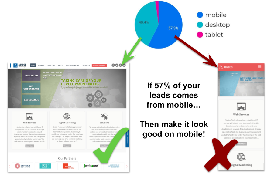
Do this now: open your Google Analytics account and check what devices are giving you the most leads.
If you get most of the traffic/leads/sales from mobile –> design for mobile.
- Limit yourself to a mobile-size canvas when generating ideas and writing copy.
- Demand mobile mockups from your designer.
- Get your developer to optimize for mobile.
- TEST everything on mobile.
2) 5 Seconds Test
This one is simple, super valuable but you do need a couple of volunteers. Ideally, they would know nothing about your business.
Open your landing page and show it to them for 5 seconds.
Then ask these questions:
- What is the purpose of the page?
- What are the main elements you can recall?
- Who do you think the intended audience is?
- Did the design/brand appear trustworthy?
- What was your impression of the design?
Stay open and prepare to be humbled. The insights are more than worth the pain of your ego getting hurt.
If the person gave the answers you were expecting, that’s great!
If not, start modifying your headline first. There’s no need to be super creative or mysterious. Start with explanations of what you do. Remember, clarity trumps persuasion any day.
The headline needs to answer:
- What’s in it for me?
- Why should I choose you over X?
Want more? Check out these lovely instructions here: https://fivesecondtest.com/
3) Motivation, Value, Anxiety
We get a lot of clients with a poorly written landing page copy and little knowledge of CRO. Of course, writing quality copy is hard and usually takes a lot of work from a fully specialized professional.
But it is still possible for a person with some writing talent to create a landing page that makes sense. These are just some basic steps that need to be followed.
Below are the obvious topics a copywriter needs to address to reach the base levels of landing page CRO:
Motivation
Typically this is what you should talk about first. Find a juicy, authentic way to express:
- Desired outcomes
- Pain points/problems
- Purchase prompts
Value
Continue with emphasizing why one would want to choose you over your competitors:
- Unique benefits
- Delightful product features
- Dealbreaker needs/requirements
Anxiety
Your clients surely have some worries – answer them ahead!
- Uncertainties
- Objections
- Perceived Risks
4) Guiding Attention
Attention is the only asset a visitor gives to you in advance. Make the most of it:
- Write short, bite-sized, punchy texts.
Take your paragraphs and change them so that they are at most 3 lines long. Divide by short bold text, which emphasizes the important stuff. - Frontload your copy.
Express the main point first. Nobody will read an eight sentence paragraph if they do not have a good reason for it. - Use visual cues.
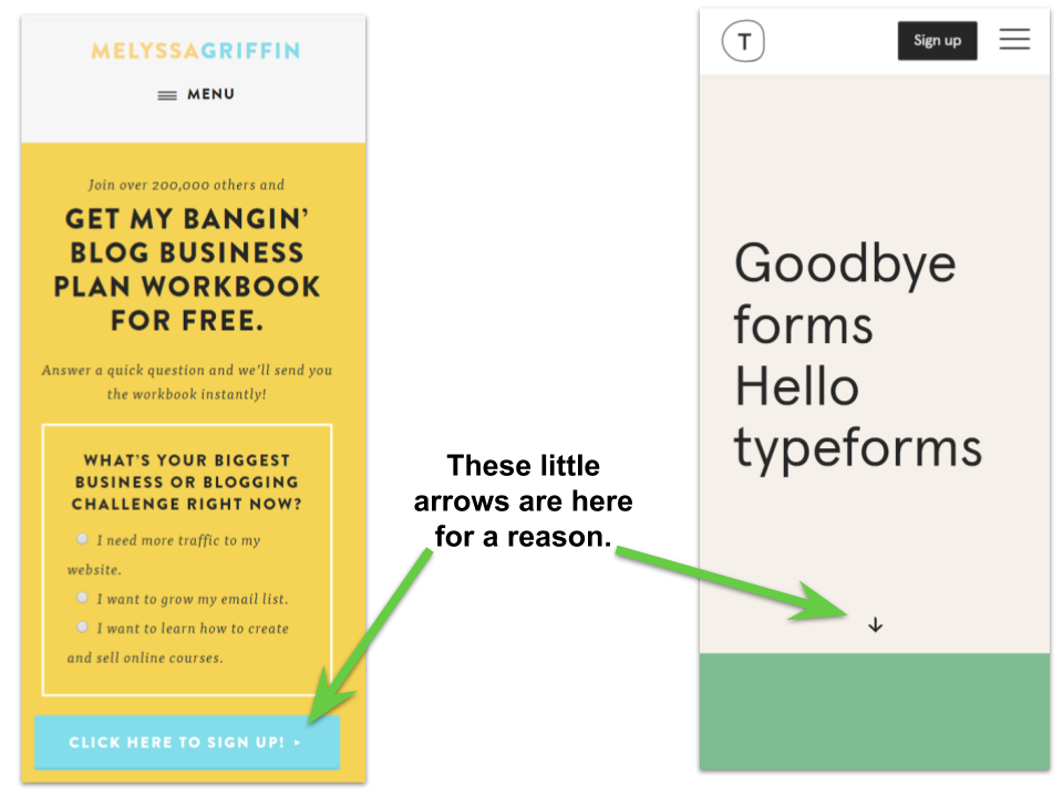
Visual cues are arrows or other elements that ‘point’ in the direction you want visitors to focus on. This is simple to do but can have a surprisingly big effect. Read more here: https://cxl.com/blog/visual-cues/
5) Make Forms Easy to Fill Out
Don’t be greedy
Forms are friction. Friction is what prevents your visitors to convert.
Which of the fields do you absolutely must collect? Are they easy to fill out? Do you have ‘autocomplete’ turned on?
Don’t put your form above the fold.
Nobody will just type their email immediately after arriving on your landing page. Visitors need to come to the conclusion, that your service/product is a solution to their problem. They will not even consider giving you anything before they can confirm this.
6) CTA Magic
Designing a good CTA is not hard. Ask yourself:
Does the CTA stand out?
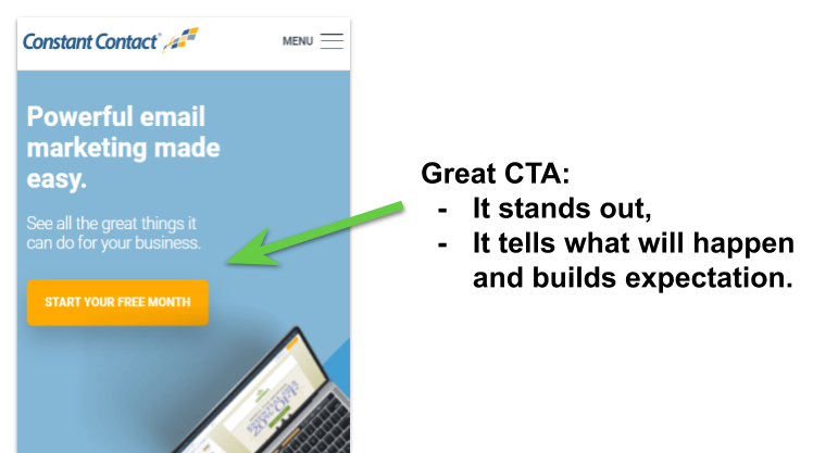
This is the single most important thing. You need to get your CTA to stand out.
How?
There’s no absolute, specific answer. It’s always a game of relativitys. Think about it in these terms:
- Is the color contrast used?
- Is the CTA button bigger than the neighboring elements? Is the text bigger?
- Is there enough white space around the button?
- Any directional cues? (arrows, graphical elements which ‘point’ to the CTA)
Does the CTA give value?
A good CTA communicates that by clicking the button visitors will get something of value.
It also clarifies the next step. This increases predictability and with it the feeling of safety and understanding what’s going on.
Hint: “Submit” is a terrible CTA.
Read more here: https://cxl.com/blog/call-to-action/
7) The Value Check
“Cut anything that’s not doing real work.” Momoko Price, https://kantan.io/
Every little bit of your copy and design falls in one of the two categories: either it increases visitor’s motivation, or it creates frustration/annoyance.
Go through your page. Think about each of the elements. Does it have a purpose?
It’s hard to truly get to the bottom of what makes your visitors convert and will give you that ideal CRO – but you can always just throw the obvious filler content out. Do it!
There’s more to learn about optimizing landing pages so why not check out The Psychology Of Web Design 101 or start Tracking Landing Pages In Google Tag Manager (or contact a Google Tag Manager Agency) and see what pages work better for your saas brand.


