Reports in Google Analytics – most people are able to install Google Analytics on a website. And that is mostly it. It is very rare that we come across an account that is properly set up with all the views, events, and conversions. And when it comes to usage? Most companies are not actually able to answer the most simple questions with Google Analytics.
In this blog post, we are covering different types of reports that are available in Google Analytics. You will see when and why you can use each report and what specific questions they are good at answering.
Dimensions vs Metrics
Reports in Google Analytics consist of Metrics and Dimensions. Let’s learn how to set them apart.
Metric
“Metrics are quantitative measurements. The metric Sessions is the total number of sessions. The metric Pages/Session is the average number of pages viewed per session.” GA support.
Metrics are numbers you can do something with in arithmetic. You can add them, subtract them, multiply, divide, and so on. Metrics are explained with labels, for example: users, sessions, bounce rate, conversion rate, transaction …
Dimension
“Dimensions are attributes of your data. For example, the dimension City indicates the city, for example, “Paris” or “New York”, from which a session originates. The dimension Page indicates the URL of a page that is viewed.” GA support
Dimensions are the things you sort by. This is how metrics in the specific report are broken down. In the example below, Source/Medium is the dimension. And you can see how, for example, users are divided between the different source/medium.

Different Reports in Google Analytics
Overview Report
Google Analytics has 5 sections: Realtime, Audience, Acquisition, Behaviour, and Conversion. Each section has a report related to its name. And each section starts with an overview report. An Overview report gives you a basic understanding of a section. Some key metrics from more detailed reports in a section are presented in overview.
Table Report
This is the most common report in Google Analytics. By default, it comes with one dimension and several metrics clustered in a few sections.
Flow Report
Flow reports enable you to see different user flows, like goal flow or purchase flow. They are a visual representation of how a user is navigating through your site. Flow reports are interactive, you can pick and observe a specific segment.
Map Report
In the Audience section under GEO, you can find nice map reports where you can visualize different metrics based on geography.
Useful Features for Customizing Reports in Google Analytics
Date Range
By default, Google Analytics will show the reports in a seven-day date range. But you can change this to any date range you are interested in. It is very important that you always make sure you are looking at the right date range.
One of the most useful features of the date range is comparison, which enables you to compare the chosen date range with the previous period, previous year, or any previous date range of your choosing.
Once you apply the comparison, Google Analytics will compare results from the date range with the results from the comparison date range and calculate the percentage of how much better or worse you are doing.
Segments
Segments are a way to compare traffic from Facebook to traffic from Google Ads. Or users who made a purchase to users who didn’t. You can apply segments to every Google Analytics report. Some of the segments are prebuilt and there is also an option to create custom segments based on your needs.
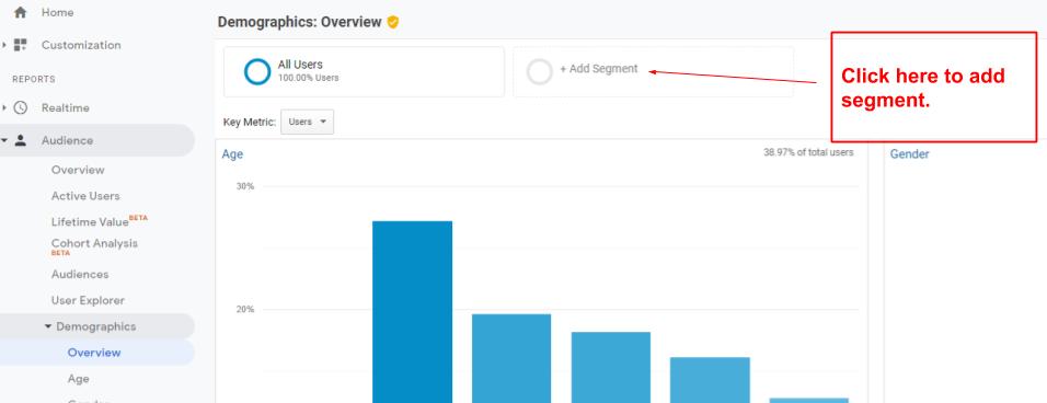
1. If you want to apply a different segment, look at the top left corner of the report you are currently in and click on “ + add segment”.

2. Choose the segment you would like to apply. For example, Sessions with Transactions.
3. Compare different segments and gain some useful insights.
Change the Primary Dimension
On table reports, you have several options for changing the primary dimension. For example, in the Audience section under Technology, click on Browser&OS and above the table on the left side you can choose between Browser, Operating System, Screen Resolution, Screen Colours, Flash Version, and Other.

Use Filters
Filters are another powerful function of the table reports in Google Analytics. You can find a blank square with the magnifying glass on the right-hand side above the table. With filters, you can filter the chosen primary dimension. And that enables you to take a deep look at something specific.
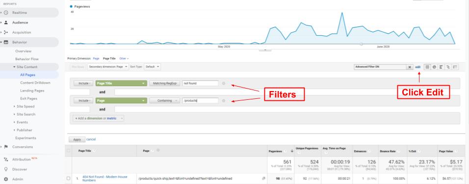
For example, navigate to the Behavior section, All pages, and choose Page Title for primary dimension. Then type “not found” in the filter field.

Add Secondary Dimension
In the previous Use Filters step, we can clearly see that in the example page something happened at the beginning of May when the number of 404 pages increased. That is already a piece of useful information for the dev team. But we can go even deeper. Google analytics has a secondary dimension which enables us to divide the primary dimension even further.
Click on Secondary Dimension above the table and type in Page, then click on the Page button in the dropdown menu.

You will get the report with Page Title as a primary dimension divided by Page as a secondary dimension. For example, in our case we can see which pages we are getting 404 errors on.

And you can dive even deeper. If you click on the edit button next to the filter field, you will be able to edit the filter in primary dimension and add a filter in the secondary dimension. In our case, for example, you can filter out only 404 product pages.

The one thing we absolutely love about Google Analytics is how you can use multiple features at the same time. You can observe a specific segment, apply a secondary dimension to the report and compare this in two different time periods. Combining those features is what makes Google Analytics a really powerful tool that can offer meaningful insights into your business.
Curious how you could best use reports in Google Analytics for your specific brand? Get in touch for a free consultation!


